
Visible Reminder of Invisible Light: Good Shepherd, Ponferrada
/Yesterday ArchDaily posted images and a description of a new church in Ponferrada, Spain by Vincens + Ramos. View the building database entry.
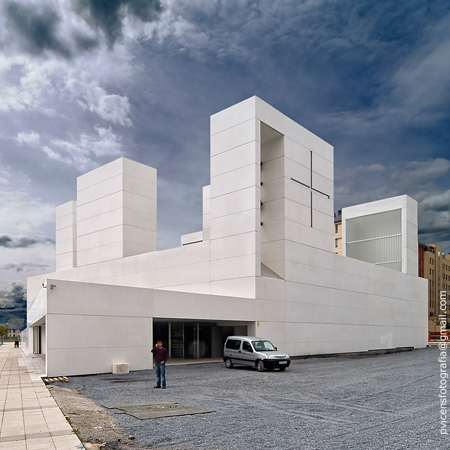
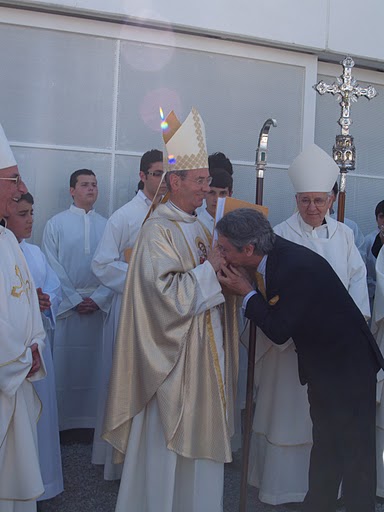
The post checked off a number of my architectural pet peeves. First, it gave the building an alternate publishing name; rather than call it by its dedication it was dubbed simply "Ponferrada Church." Presumably this is more marketable in the architectural press. Second, the photos used of the interior have been heavily post-produced to the point that I could not tell if they were indeed photographs or renderings. Fortunately, some digging allowed to me rectify the first complaint. And having the true name of the church (Good Shepherd) then led to more honest photographs of the consecration from the parish.
Here's a before and after.
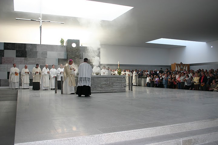
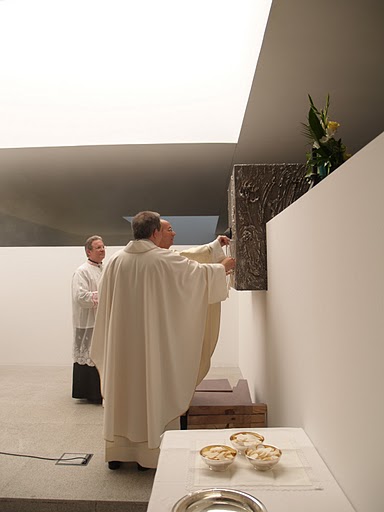
Consecration from the parish website ...
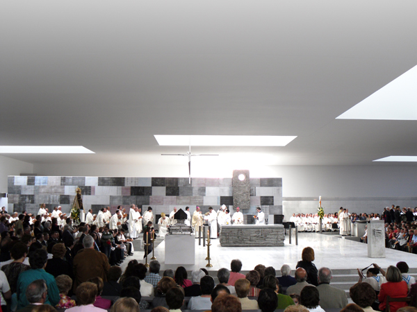
... and from the architects.
Clearly the architects put great stock in the whiteness of the ceiling and the materials in general. Without being there in person it is difficult to know what the experience truly is, but my guess is towards the former. Although the human eye is far better at picking up subtleties than a camera lens, the high contrast of the light entering through the skylights will darken the ceiling. Note too that the ceiling joints have been blurred and the corners corrected in the architect's photos; but note also that the undoctored photos reveal an unusually high degree of precision craft in the surface.
Now for the church itself, setting the presentation aside...
The architects make the familiar claim that "the fundamental premise of the project has been the faithful implementation of all the functional and symbolic requirements demanded by the new provisions adopted by the liturgical reform" presumably the Second Vatican Council and the subsequent changes made to the GIRM. There are, in fact, relatively few requirements so demanded and many of those have a broad range of valid interpretations.
However, in this case there are a few features that stand out as notable in this regard. Most of the Roman Catholic requirements for church buildings end up as paradoxes when it come time to give them physical form. Most prominent is the balance between the worthily distinguished hierarchy of the roles of people and objects in the liturgy and the unified active participation of the whole expression of the Body of Christ.
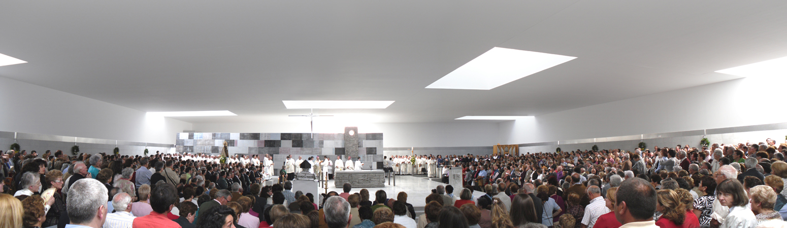
A major contributor to this balance is the contrast of the people against the white background, whereby the congregation becomes visually the substance of the church. But the form of their mass surrounding the sanctuary creates an accentuating exception marking the altar apart without the need for a more substantial physical presence. The height of the sanctuary compared to the height of the standing congregation and their raked seating is just right; were it flat as in many other contemporary churches of similar arrangement it would be lost or require much greater space to retain a similar dignity. This would in turn ruin the rather surprising intimacy seen here. In this church the people are brought to the level of the altar rather than the other way round.
The architects tackled another of the rather difficult problems of Catholic church design with this building: the placement of the tabernacle. There are staunchly held views on the issue, none of which are truly satisfactory and which we will not elaborate on here. Here the architects made the Blessed Sacrament Chapel drive the configuration of the church.
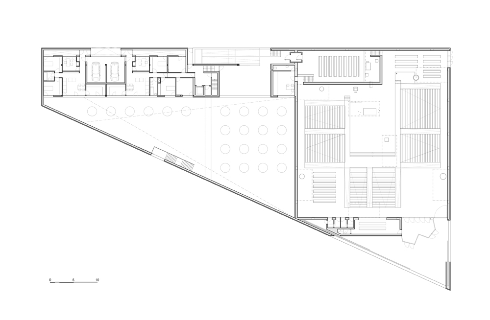
The Blessed Sacrament Chapel sits on the more accessible neighborhood street with its own entrance over the sunken interior courtyard. The focal point of the chapel corresponds with the opening of one of 7 major skylights in the continuous plane of the nave ceiling.
This is where it gets clever; the chapel is not an enclosed volume unto itself but continuous with the main body of the church. The wall to the front and right of the chapel is a low screen wall whose reverse serves as an abstract reredo to the sanctuary. Thus the tabernacle in the picture above is the same as in one below. The disparate floor height creates an intimate setting within the chapel and a elevated monumental expression (with an aperture for exposition) within the sanctuary, in each case the fitting attitude for the use.
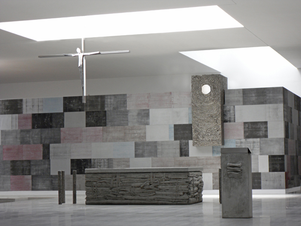
While this tabernacle is centered on the axis of the altar and the processional aisle, the offset of this axis and the asymmetry of the screen wall behind mediates the centrality of the tabernacle. Thus the tabernacle has a place of primacy but it does not necessarily appear to be the focal point of the worship. And the common tonality of each element of the sanctuary compliments the sense of ensemble given to the liturgy.
Although I have not strictly addressed the visual or tectonic nature of the architecture (personally, the jury is still out for me on that one), there is much in this design to suggest a fruitful engagement with the liturgical needs and requirements which is commendable. I expect to see much more of this project in publication (much like the architects' previous church which graces the cover of Closer to God). For better or worse, St Monica may be more the architectural standout, but Good Shepherd is certainly the liturgical superior.
One final note on the architects' description. They begin the following verse without attribution:
"Joined with the artist eye, new life, new form, new color. Out of the sea of sounds the life of music, Out of the slimy mud of words, out of the sleet and hail of verbal imprecisions, approximate thoughts and feelings, words that have taken the place of thoughts and feelings, There spring the perfect order of speech, and the beauty of incantation.
The work of creation is never without travail Light Light The visible reminder of Invisible Light."
The concluding line is omitted:
"O Light Invisible, we praise Thee! Too bright for mortal vision."
This is from T.S. Eliot's choruses written for The Rock (read the full text here), a theatrical fundraiser held in 1934 to benefit the Forty-Five Churches Fund of the Diocese of London. Thus both the content and the purpose address the needs and nature of churchbuilding.